Mobile Optimised Websites
Mobile optimisation used to often involve building a dedicated mobile application running parallel to a client’s main website. The more modern approach is to make a client’s website ‘responsive’, meaning it is responsive to the size of the device it is being viewed on.
This means the website visitor sees the same website whether they are browsing on a laptop, tablet or mobile device. The structure of that website detects the size of the screen being used, and re-structures accordingly.
Visitor Experience
The biggest benefit is to the website visitor. Instead of having to ‘pinch to zoom’ and pan side-to-side to read a wide layout, the webpage adapts to the width of the device, improving legibility, making the visitor more likely to remain on the website.
Many clients see more visits from users on tablets and mobile devices than visit using desktop computers or laptops. This highlights the importance of ensuring your website is optimised for small screens.
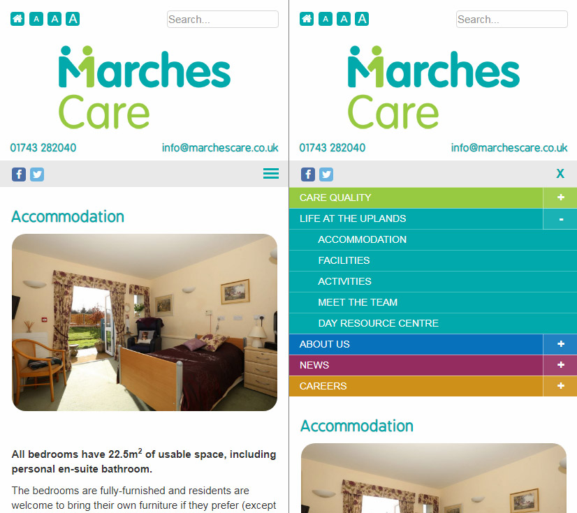
Optimised websites will usually have a dedicated mobile menu, accessible via an icon. On a desktop view a menu may appear when hovering over it. On a mobile device however we do not have the hover effect to rely on.
Search Engine Benefits
Google recently announced that mobile optimisation would be included as a ranking factor for websites in their search results. A visitor searching on Google using a mobile device, is more likely to see a mobile optimised website higher up the search rankings.
Another key factor Google considers is page speed for mobile devices, so it is important to ensure mobile optimised websites are not slowed up by slow loading high resolution images.
How We Can Help
All new websites we work on are optimised for mobile as standard. We can also ‘retrospectively’ optimise existing websites and implement a mobile menu for most sites. Contact us to see if this is possible with your existing website.
Case Study

Marches Care
Take a look at Marches Care on a tablet or mobile device to see how the website adapts and introduces a mobile menu on smaller screens.
Read More